New Year’s is a time for change, for bettering oneself, for taking that first step towards the future. It’s no different at Immuta – we’ve resolved to make our Data Security Platform even better for our customers. And just like our New Year’s fitness goals start with simple habits, our new and improved experience starts with some basic changes to Immuta’s data source list.
A Brief Overview of Immuta’s Data Source List
The data source list provides a directory of all of the tables and views in Immuta. It’s the primary screen for navigating and working with the data that Immuta governs.
What’s New with Immuta’s Data Source List?
Immuta’s new data source list features both a slimmed down, more readable design, and more metadata at your fingertips. By expanding any given row, you can see basic information about the data source, such as tags applied to it, data governance permissions, the data source ID, and more. This provides transparency into the tags and rules applied to data sources, as well as valuable metadata that adds context for users.

Additionally, the page’s filters are consistent across other pages within the Immuta UI. The filters are initially limited to those that were available before this redesign, but we’ll be expanding the available options in the future.
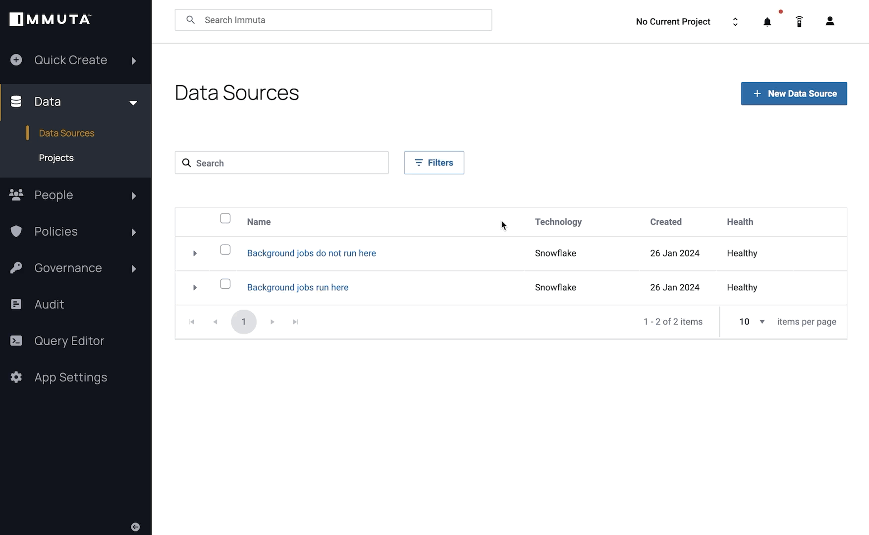
Finally, we’ve updated the action menus to be more consistent with Bulk actions. Now, if you can perform an action in bulk —like adding data sources to projects or adding tags — you can also do it on a single table. This consistency helps you quickly understand and find available actions that you can take on your data, so you can protect and leverage data faster and more efficiently.
The new experience is currently in public preview for Immuta’s SaaS customers. These customers will automatically receive the updated data source list (with a feature flag to roll back the change in case of concerns). Immuta’s team will monitor usage and feedback, with plans to make it generally available in late winter 2024.
What’s Next?
There are a few other recent improvements in the latest Immuta UI. Unlike the data source list, these updates are already generally available.
- Our new, more readable User Profile page better separates out information like user attributes, and makes it easier to understand.
- Keyboard shortcuts are now available for some common functions. Keep an eye out for in-app guidance that helps with how to use them.
- The Account menu is wider for better readability, and now has an option to toggle between light and dark modes (by default, Immuta still uses your browser settings).
- Browser tabs will tell you which page you’re on, instead of all being labeled “Immuta Console.” We have a new, adaptive favicon so you can still tell it’s Immuta at-a-glance, whether you’re in light or dark mode.
All of these changes were made by the team members participating in Immuta’s latest UX Hackathon. And they’re the tip of the iceberg; more enhancements from the Hackathon are coming to Immuta in the near future.
Have questions or feedback on Immuta’s new features? Get in touch to share your thoughts at [email protected], or get started by requesting a demo with our team.
Get Started with Our Team